Pi day quiz

Today is the Pi day – an annual celebration of the mathematical constant Pi. It is observed every year on March 14, since Pi can be approximated by 3.14, and the this date is written as 3/14 in the month/day format.

To celebrate this day, here is a short quiz about Pi. You can find all the answers on the web, but it is more fun to try answering while depending only on personal knowledge. Let’s go!

1) In the ancient world, many cultures derived approximations to Pi. Which ancient culture had the best approximation?
a. Egypt
b. Babylon
c. Hebrews
d. India

2) Which of these fractions is the best approximation Pi?
a. 2549491779/811528438
b. 22/7
c. 3927/1250
d. 864/275

3) Who popularized the use of the Greek letter Pi to represent the ratio of a circle’s circumference to its diameter?
a. Carl Friedrich Gauss
b. Leonard Euler
c. Pierre Simon Laplace
d. Issac Newton

4) The problem of squaring the circle does not have a solution because Pi is
a. An algebraic number
b. A rational number
c. A transcendental number
d. An irrational number

5) Who prove that the problem of squaring the circle does not have a solution?
a. Carl Friedrich Gauss
b. Adrien Marie Legendre
c. Ferdinand von Lindman
d. Evariste Galois

6) Pi plays an important role in Statistics because
a. Numerical proportions can be illustrated by a pie chart
b. The sample size calculation formula contains Pi
c. The probability density function of the Normal distribution contains Pi
d. Pi is the maximal value of Euler’s population density curve

7) Who was born on Pi day?
a. Johann Strauss
b. Wolfgang Amadeus Mozart
c. Johann Sebastian Bach
d. Georges Bizet

8) The value of Pi is implied as equal to 3 in:
a. The New Testament
b. The Bible
c. The Quran
d. The Epic of Gilgamesh

9) The first known rigorous algorithm for calculating the value of Pi was devised by
a. Shankara Variyar
b. Liu Hui
c. Archimedes
d. Ibn al-Haytham

10)  Who had the digits of Pi engraved on his tombstone?

a. Ibn al-Haytham
b. Émilie du Châtelet
c. Jean Victor Poncelet
d. Ludolph van Ceulen

Good luck! I will post the answers next week.

Creating MS Word reports using the officer package

Commonly, the final product that a data scientist or a statistician generates is a report, usually in MS Word format. The officer package enables generating such a report from within R. It also enables generating PowerPoint presentations, but this is beyond the scope of this post.

While the package has many great features,  using the package is not intuitive. The package manual covers no less than 80 pages. There are many functions that allow controlling many aspects of Word documents and PowerPoint presentation.

What I really need is to perform two tasks: inserting tables and figures into my Word document, and I also want to apply a standard format to all of my reports. I also need to add titles, empty lines and page breaks.

For these needs, I wrote a few functions that enable me to create standardized Word document reports using an intuitive syntax.

In addition to the officer package, the flextable package is also needed:

library(officer)
library(flextable)

The first function creates a new object that represents the Word document to be created. It simply wraps officer’s read_docx() function, with the caveat that if an object with the same name already exists, it overrides it with a new “clean” object:

# create new word document
new.word.doc=function(){
  my.doc=read_docx()
  return(my.doc)
}

The next two functions to add an empty line or a page break:

# add an empty line
add.empty.line=function(doc){
  body_add_par(doc, " ")
  return("empty line added")
}

#add page break
add.page.break=function(doc){
  body_add_break(doc, pos="after")
  return("page break added")
}

The next two functions are used to set the orientation of the next page to landscape, and then back to portrait:

# start landscape
start.landscape=function(doc){
  doc=body_end_section_continuous(doc)
  return("landscape orientation started")
}

# end landscape
end.landscape=function(doc){
  doc=body_end_section_landscape(doc)
  return("landscape orientation ended")
}

This function adds a title. I use the fp_text() function to set the font size to 14, and the font type to bold. I also add an empty line after the title:

# add a title
add.title=function(doc, my.title){
my.prop=fp_text(font.size = 14, bold = TRUE, font.family = "Times")
the.title=fpar(ftext(my.title, prop=my.prop))
body_add_fpar(doc, the.title)
body_add_par(doc, " ")
return("title added")
}

The next function is a little bit more complicated. It adds to the document a figure that already exists as an image file in the working directory. The parameters h and w indicate the height and width of image within the document, in inches. My usual values of choice are h=5 and w=5, so I set them as default. I align the figure to the center of the page.

# add an image, such as a jpg or png file
add.image=function(doc, image, h=5, w=5){
  body_add_img(doc, src=image,
               height=h, width=w,
               style="centered")
  return("image added")
}

The last function, add.table(), is the most complicated one. The table to be added is a data frame, and my function assumes that the variables in this data frame are either character, factor or numeric.

I have two parameters to set the number of decimals to present for each of the numeric variables. The first parameter receives the names of the numeric variables, the second contains the number of decimals for each of these variables, respectively.  Note that I do not check the inputs of these two parameters. I trust myself to insert the right input.

In addition, the function sets the format of the table (borders, fonts, and header formatting) according to my standard report style, using officer functions such as border_outer(), bold() etc.

# add a data frame as a table
add.table=function(doc, tbl, col.keys=NULL, col.digits=NULL){
  # create basic flextable
  f.table=qflextable(tbl)

  # set numbers of decimals for numeric variables, if specified
  if(!is.null(col.keys)){
    for(j in 1:length(col.keys)){
      f.table=colformat_num(x=f.table,
                            col_keys=col.keys[j],
                            digits=col.digits[j])
    }
  }
  
  # set table borders
  f.table=border_outer(f.table, part="all",
                       border=fp_border(color="black", width = 1))
  f.table=border_inner_h(f.table, part="all",
                         border=fp_border(color="black", width = 1))
  f.table=border_inner_v(f.table, part="all",
                         border=fp_border(color="black", width = 1))
  
  # set fonts
  f.table=font(f.table,  fontname = "Times", part = "all")
  # also set the table's header font as bold
  f.table=bold(f.table, part = "header")
  
  # add the table to the document
  flextable::body_add_flextable(doc, 
                                value = f.table, 
                                align = "left" )
  return("table added")
}

Now we are all set to create the report:

# create an histogram and save it as a png file:
png(filename="histogram.png", width = 6, height = 6, units = 'in', res = 300)
hist(mtcars$wt)
dev.off()

# create a data frame that will become a table in my report
wide.table=mtcars[1:6, ]
wide.table$car=rownames(wide.table)
wide.table=wide.table[, c(12, 1:11)]
narrow.table=wide.table[, 1:4]

# create a new document object
doc=new.word.doc()

# add the report title and an empty line
add.title(doc, "My report")
add.empty.line(doc)

add.title(doc, "narrow table")
add.table(doc, narrow.table, col.keys=c("mpg", "disp"), col.digits=c(1,0))

add.page.break(doc)

# add the histogram with an apropriate title
add.title(doc, "Histogram - portrait")
add.image(doc, "histogram.png", h=3, w=3)

# set the orientation to lndscape
start.landscape(doc)

add.title(doc, "narrow table - landscape")
add.table(doc, narrow.table, col.keys=c("mpg", "disp"), col.digits=c(1,0))

add.empty.line(doc)

# add the wide table in landsacape page orientation
add.title(doc, "wide table in landscape orientation")
add.table(doc, wide.table, col.keys=c("mpg", "disp"), col.digits=c(1,0))

#set the orientation back to portrait
end.landscape(doc)

add.title(doc, "narrow table")
add.table(doc, narrow.table, col.keys=c("mpg", "disp"), col.digits=c(1,0))

# generate the Word document using the print function
print(doc, target="My report.docx")

Since I cannot upload a Word document to WordPress, here is a screen print of the report:

Visualization of the Debt/GDP ratio and national debt level

I saw this graph on Twitter a few days ago: [1]

Short googling revealed that this is a relatively old graph from October 2017. On one hand, this is a really cool visualization. On the other hand, it also belongs to Facebook pages such as Trust me, I’m a Statistician or Trust me, I’m a Data Scientist.

What do we see?

This is a kind of a pie chart. In a classic pie chart, the slices are in the form of “triangles”, or more precisely, circular sectors. In this chart the slices have other forms, including various types of triangles and quadrilaterals, other polygons, and shapes that I really don’t know their names. [2]

I admit that this chart pretty confused me. It presents national debt and Debt/GDP ratio data. Initially I referred to the Debt/GDP ratio, and for some reason I thought that the area of ​​each slice in this chart represents Debt/GDP ratio of each country, probably because my eye first caught the chart’s footer.

Actually, each slice shows the share of the country’s national debt out of the world’s total debts, so the areas of all pieces should sum to 100% [3]. We see clearly that the country with the largest share of debt out of the total world national debts (and therefore the highest absolute debt) is the United States. The country with the second largest share of debt is Japan, and China is third. Look for Italy, Germany, France and the United Kingdom. Can you determine which of the four states has a bigger share of the total debt by looking just at the area of their slices? Actually, their shares of the total debt are very similar.

The Debt/GDP ratio of each country is expressed by the color of its slice. The lighter the color, the higher the Debt/GDP ratio. You can immediately see that Japan has the highest Debt/GDP ratio, and I believe that most people will recognize that Greece also has a very high Debt/GDP ratio, actually the second highest ratio. Can you spot the country with the third largest ratio? It is Lebanon.  Look at the upper right area of the chart. Italy and Portugal, which occupy fourth and fifth place, are more prominent. Can you tell which country has the lowest Debt/GDP ratio?

Now that we understand the data presented in this graph, we can start looking for insights.

This chart is a two-dimensional chart, in the sense that it presents two different variables in the same graph. Such graphs are useful for exploring the relationship between the two variables. So, what is the relationship between the Debt/GDP ratio of a country and its share in the world’s total debts? Can you see anything? I can’t. It is to the credit of the authors that they did not try to discuss this matter at all.

Is there a better way to visualize these data? Of course there is. Let’s play.

I took the world’s Debt/GDP ratio data  and the world’s GDP data from Wikipedia. For the purpose of the demonstration, I focused on the OECD countries data from 2017. I calculated the absolute debt of each country using the Debt/GDP ratio and the GDP data, and then I calculated for each country its share of the total OECD debt. The data are available here.

The simplest possible visualization for two dimensional data is a scatter plot, although it is not as cool as that pie chart. Let’s forget what we learned by looking at that pie chart, and start from scratch.

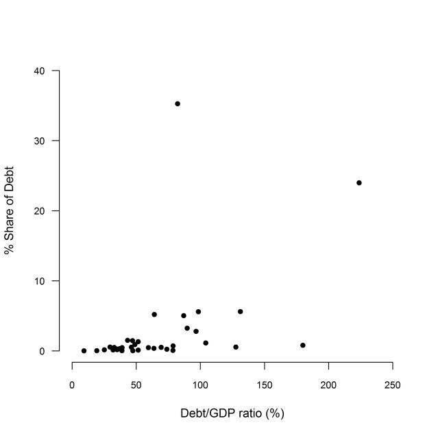
This code generates a basic scatter plot of the OECD data:

plot(c(0,250), c(0, 40), axes=FALSE, type="n", xlab="Debt/GDP ratio (%)", ylab="% Share of Debt", main="", cex.main=1)
axis(1, 50*(0:5),cex.axis=0.8)
axis(2,at=10*(0:4), las=1, cex.axis=0.8)
points(oecd$debt.gdp.ratio, oecd$share.of.debt, type="p", pch=16, cex=1, col="black")

The plot clearly shows that there are two outlier dots/countries; One country has Debt/GDP ratio greater than 200%. Another country has an awfully large debt – its share of total OECD debt is higher than 30%.

A closer look reveals a country whose Debt/GDP ratio is greater than 150%, and two more countries whose Debt/GDP ratio is about 130%.

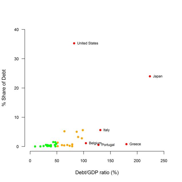
Since some economists who believe that high debt is bad, and that high Debt/GDP ratio is even worse, I decided to divide the countries into three groups: [4]

  • The first group includes the countries with either Debt/GDP ratio which is greater than 100% or their share the total debt is greater than 10%. These are countries that are in “bad” economic situation according to these parameters.
  • The second group includes the countries whose Debt/GDP ratio is less than 50% and their share the total debt is greater than 2%. These are countries that are in “good” economic situation according to these parameters.
  • The third group includes the rest of the countries.

I decided to paint the dots that represent the countries which are in “bad” economic situation in red, and to add their names on the graph. I painted the dots that represent the countries which are in “good” economic situation in green. The rest of the dots are painted in orange.

This code generates the improved scatter plot:

w1=which(oecd$debt.gdp.ratio>100 | oecd$share.of.debt>10)
w3=which(oecd$debt.gdp.ratio<50 & oecd$share.of.debt<2)
w2=which(!(1:36 %in% c(w1,w3)))

plot(c(0,250), c(0, 40), axes=FALSE, type="n", xlab="Debt/GDP ratio (%)", ylab="% Share of Debt", main="", cex.main=1)

axis(1, 50*(0:5),cex.axis=0.8)
axis(2,at=10*(0:4), las=1, cex.axis=0.8)

points(oecd$debt.gdp.ratio[w1], oecd$share.of.debt[w1], type="p", pch=16, cex=1, col="red")

text(x=oecd$debt.gdp.ratio[w1],
     y=oecd$share.of.debt[w1], 
     labels=oecd$country[w1], 
     pos=4, cex=0.7)

points(oecd$debt.gdp.ratio[w2], oecd$share.of.debt[w2], type="p", pch=16, cex=1, col="orange")

points(oecd$debt.gdp.ratio[w3], oecd$share.of.debt[w3], type="p", pch=16, cex=1, col="green")

Now we can see that:

  • The Debt/GDP ratio of the “good” states extends over the entire zero to 50% range, although the Debt/GDP of many countries in this group is close to 50%.
  • The orange painted countries (the “middle” group) are roughly divided into two subgroups. The countries in the first subgroup have lower debts (as expressed by percent share of the total debt) and a Debt/GDP ratio in the range of 50 to 75%. The five countries in the second subgroup have higher debts , with no clear pattern for the Debt/GDP ratio.
  • I cannot draw a general conclusion regarding the 6 countries which are in “bad” economic situation according to my definitions.

Comments

[1] I did some minor edits to the graph for the purpose of my demonstration.

[2] Look for the United Kingdom at the bottom of the chart, for example.

[3] I didn’t check any of the data. I trust the authors that the date is accurate.

[4] I chose the cut points of 10%, 100% etc. according to my best judgment. If you know an economist who has a more accurate method to determine such cut points, please introduce him to me.

The lady tasting iced tea

As part of the parents involvement in my youngest son school, last Friday was the “parents teaching” day, where parents presented various topics that may interest the students. I chose to try the reproduce Fisher’s lady tasting tea experiment, but with a twist.

I started the class with general discussion on designing experiments, and presented the story of the lady and the tea. Then I asked them how they would test if the lady can actually tell whether the tea or the milk was added first to a cup. After a short discussion, the 11 years old students reached the design that Fisher used. Of course, I did not expect them to get into the statistical inference details.

Once we got a design, I pooled two bottles of iced tea out of my bag. In Israel there are two leading brands of iced tea, lets call them A and B. A few more minutes were needed to get to the design of an experiment for testing whether the kids can distinguish between the tastes of the two brands.

We used the following design:

  1. A flip of a coin determined if we will pour the same brand of iced tea into two cups, or pour one brand in one cup and the other brand into the other cup.
  2. In case the same brand should be poured into the two cups, another coin flip determined if it should be brand A or brand B.

Then, one of the students who was, of course, blinded to the process of filling the cups, tasted the tea in both cups and announced if she can distinguish between the tastes of the tea in each cup, and her answer was recorded.

The final results are [*]:

Was the taster right?
Yes No Total
Cups combination AB 5 5 10
AA or BB 4 3 7
Total 9 8 17

I think we can conclude that there is no evidence for rejecting the hypothesis that the students can distinguish between the tastes of the two brands (you are welcome to do your own statistical analysis).

On a personal note: from my point of view it was a great success, since my son, who refused tasting brand B was convinced to taste it, and admitted that he likes its taste.

[*] I know I should have recorded the outcomes of the re-randomization, so that the table will have 3 rows and not only two. You will have to forgive me. My only excuse is that was a fun demonstration for fifth graders.

A lot of bad statistics in one picture

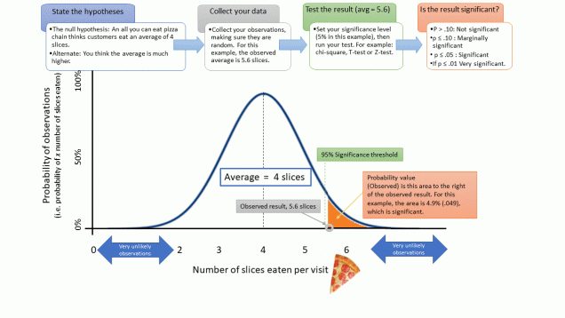
I found this picture on twitter, thanks to Kareem Carr who took a screenshot before the person who uploaded it deleted his tweet. I googled and found it in a website named Data Science Central (No link. Sorry). Can you tell what is wrong in this picture?

p-value in one picture???


Well, almost everything is wrong in this picture.

Let’s start with the flowchart on the top.

The null hypothesis is that the average number of pizza slices is 4 and the alternative hypothesis is much higher than 4. What does “much higher” mean? Normally the hypotheses would be Ho:µ<=4 and H1:µ>4, or maybe Ho:µ=4, H1:µ>4, if you are looking for one sided hypothesis. I understand “much higher” as µ>>4, or µ>4+Δ. Now the hypotheses are not exhaustive: there is a gap of Δ. If you studied a course on statistical inference and are familiar with the Neyman-Pearson Lemma, it should not be a problem. You can construct a likelihood ratio test. But then you do not need this picture. The way the hypotheses are stated, standard tests as z-test or t-test are not valid.

Collect your data: there is not much information on how to collect the data except for mentioning to make sure that the observations are random. I suppose that the author assumes that the readers are familiar with standard sampling methods. Or maybe there is a “Data Collection Explained in One Picture” somewhere. I am too afraid to google it.

The author states that in this example the average is 5.6. What about the standard deviation and the sample size?

Next in the flowchart: test the result. The author requires setting the significance level, which is good. However, a good statistician will set the significance level before collecting the data. He will also set the desired power and collect the sample size.

Then you should run the test, e.g. chi-square, t-test or z-test. Again, this should be decided before collecting the data.

Next you need to decide if the result is significant. The author suggests four levels of significance according the value of the p-value. This is totally wrong. The result is either significant or not significant. Statistical significance is not a quantitative property.  The author suggests using the p-value not just for determining significance but also as a measure for the strength of evidence.

Oh, and one more thing: if p<=.01 it is also <=.05 and <=0.10.

Now let’s look at the nice graph with the bell shape curve, which is almost certainly the Normal Distribution density curve. But look at the Y-axis label: “probability of X number of slices eaten”.

No, it is not probability, it is density, under the assumption that the null hypothesis is true (and this assumption is not stated anywhere).

And it is not the density of the number of slices eaten per visit as the X-axis label says, but the density of the sample mean. Again, one should state that this distribution is derived assuming the null hypothesis is true.

And even if it was a probability, the maximal value of the curve would be much lower than 100%. In fact, the probability of a customer eating less than one slice is zero (otherwise, why would he pay for the pizza in the first place?), and as far as the restaurant concerns, if the customer ate 1.5 slices, it counts as two slices – there is no recycling. In any case, the sample mean cannot be lower than 1. This brings me back to the statistical test. The variable under consideration is a count variable, therefore there are better alternatives to test the hypotheses, even though a normal approximation should work if the sample size is sufficiently large.

Next is the p-value calculation. The calculated p-value is 0.49. This means that if the mean under the null is 4, and the sample mean is 5.6, then we can back calculate and find that the standard error is 0.967 and the 95% significance threshold is 5.591. That’s fine.

Finally, the explanation of what is actually the p-value is clumsy. The term “Probability value (Observed)” may lead someone to think that this is the probability of the observed sample mean.  However, the author states correctly that the p-value is the area (under the normal curve) right to the observed result.

So what we got here? Poor example, negligent descriptions of the statistical process and concepts (to say the least), somewhat reasonable explanation of the p-value calculation, no explanation of what the p-value actually is and what it means, and finally abusing the p-value and its interpretation.

And personal note: why would I care? Someone is wrong on the internet. So what?

I care because I care about statistics. There are similar pictures, blog posts and YouTube videos all over the internet. And they cause bad statistics and bad science. P-values and other statistical concepts are abused on a daily basis, even in leading journals such as JAMA. And bad statistics lead to loss of money if we are lucky and to loss of lives if we are not so lucky. So I care. And you should care too.

Credit: some of the issues discussed in the post were brought up by Kareem and other Twiterers.

Nobel Prize in Mathematics

During this week, the 2019 Nobel Prize winners are announced. We can be sure that nobody will win the Nobel Prize for mathematics. The reason is simple. There is no Nobel Prize for Mathematics.

There are many urban legends regarding this. Most of them relate to an alleged love affair that Ms. Nobel had with a prominent mathematician. These stories conclude that Alfred Nobel did not want to award a prize for mathematics, since his wife’s lover is a leading candidate to win the prize. The most famous of this stories relates Ms. Nobel to the French mathematician Augustine Cauchy. Nice story, but Alfred Nobel was not married.

There is no Nobel Prize for Mathematics, but the Nobel Prize was awarded to mathematicians many times. Some of the most prominent winners were mathematicians John NashRobert Aumann and Kenneth Arrow, who all won the Nobel Prize of Economics. However, some will argue that the Nobel Prize in Economics is not a real Nobel Prize but a Nobel Prize. Oh well.

In addition, many mathematicians won the Nobel Prize in Physics, because in fact one cannot engage in high-level physics without proper mathematical education, and engaging in theoretical physics for themselves need to develop innovative mathematical tools.

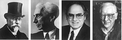
My research has shown that four mathematicians have won Nobel Prizes that are not in Economics or Physics. Two won the Literature Prize, and two others won the Chemistry Prize. In this post I will review them and their work.

Four mathematicians who won the Nobel Prize. From left to right: Jose Echegaray (Literature, 1904), Bertrand Russell (Literature, 1950), Herbert Hauptman (Chemistry, 1985), John Pople (Chemistry, 1998).

The first mathematician to win the Nobel Prize was the Spanish Jose Echegaray. Echegaray was born in Madrid in 1832. He demonstrated his mathematical talent at a very young age, and was appointed professor of mathematics at the University of Madrid at the age of 21. In addition to his work in mathematics, he devoted his time to research in economics and worked to promote Spain’s international trade. With the abolition of the Spanish monarchy in the revolution of 1868, he retired from his academic position and was appointed Minister of Finance and Education of the Spanish Government. With the restoration of the monarchy in 1874, he retired from political life and began a new career as a writer, producing a series of successful satirical plays presented throughout Europe at the end of the 19th century. These plays earned him the Nobel Prize for Literature, awarded to him in 1904. Had Echegaray’s mathematical skills been useful to him in his literary career? Maybe. Literature scholars praise the meticulous structure of his plays. More likely, he was a very talented man who succeeded in everything he has done.

Another mathematician won the Nobel Prize for Literature 46 years later. The prize was awarded to Bertrand Russell in 1950. The prize committee noted it was awarded to him for his writings, which are “a victory for human ideals and freedom of thought”. Among these writings are the Foundations of Geometry (1897), A Critical Review of Leibniz’s Philosophy (1900), The Foundations of Mathematics — the monumental work he wrote with Whitehead between 1910 and 1913, and Introduction to Mathematical Philosophy (1919). All these books dealt with logic, along with his many other writings in many other fields. Bertrand Russell undoubtedly won the Nobel Prize for his mathematical work.

In 1985 another mathematician met with the King of Sweden. Herbert A. Hauptman , a mathematician who worked at the Institute for Medical Research in Buffalo, New York, shared the Nobel Prize with his fellow chemist Jerome Karl. Hauptman developed an algorithm that combined geometric and probabilistic methods to determine the molecular structure of materials using x-rays. This method, when applied in the 1980s by a computer, shortened the amount of time needed to determine the molecular structure of simple biological molecules from two years to two days, making it possible to determine the three-dimensional molecular structure of vitamins, hormones and antibiotic materials easily, to be used in the development of new drugs.

In 1998 another mathematician won the Nobel Prize in Chemistry: John A. Pople . He won the Nobel Prize for the development of new computational methods in the field of quantum chemistry. Pople sought and found methods for solving Schrodinger equations, the fundamental equations of quantum theory. These equations were previously considered insoluble, except for a few simple special cases. The software he developed for the implementation of his methods bears the name “Gaussian”, and is now used as the basic work tool of any chemist.

We must abandon the p-value

Just a couple of weeks ago I wrote here that we should not abandon statistical significance. No, I did not change my mind. We should not abandon statistical significance but we must abandon the p-values.

Executive summary: p-values make a false impression that statistical significance is a continuous concept, but it is not. It is dichotomous.

You are welcome to read on.

I will not get into a lengthy discussion on the difference between Fisher‘s significance testing and Neyman and Pearson‘s hypothesis testing. In short: Fisher had a null hypothesis, a test statistic and a p-value. The decision whether or not to reject the null hypothesis based on the p-value was flexible. Indeed, in one place Fisher suggested to use the 5% threshold for deciding significance, but in other places he used different thresholds.

Neyman and Pearson’s approach is totally different. In their framework there are two hypotheses: the null hypothesis and the alternative hypothesis. The Neyman-Pearson lemma provides as a tool to construct decision rule. Given data, you evaluate the likelihood of these data in two cases: once assuming that the null hypothesis is true, and then assuming that the alternative hypothesis is true. You reject the null hypothesis in favor of the alternative if the ratio of the two likelihoods exceeds a pre-defined threshold. This threshold is determined by the significance level: an acceptable probability of falsely rejecting the null hypothesis (in a frequentist manner), that meets your scientific standards.

When I was a young under-graduate student, we did not have easy access to computers in my university (yes, I am that old). So we calculated the test statistic (Z, t, F, chi-square) and looked in a table similar to this one to see if our test statistic exceeds the threshold.

Fisher was a genius, and so was Karl Pearson. They developed statistical tests such as F and Chi-square based on geometrical considerations. But when you try to construct a test for equality of means as is in ANOVA or a test for independence of two categorical variables by using the NP lemma, you get the same tests. This opened a computational shortcut: The NP decision rule is equivalent to a p-value decision rule. You can decide to reject the null by comparing your test statistic to the value you look up in a table, or by comparing the p-value to your pre-determined significance level. You will get the same result either way. But still, you either reject the null hypothesis or you don’t. The size of the test statistic or the p-value does not matter. There is are such things as “nearly significant”, “almost significant”, “borderline significant” or “very significant”. IF your pre-determined significance level is 0.05, and your p-value is 0.051, that’s really depressing. But if you declare that your result is “almost significant”, it means that you changed your decision rule after the fact.

Let me illustrate it with a story my teacher and mentor, Professor Zvi Gilula, told me once.

Someone robbed a convenience store in the middle of nowhere. The police caught him and brought him to court. There were three eye witnesses, and a video from the security camera. The jury found him guilty and he was sentenced to serve 6 months in jail. In statistical jargon, the null hypothesis states that the defendant is not guilty, and the jury rejected the null hypothesis.

Let’s look at another robber. This man robbed a convenience store in New York City, next to Yankee Stadium.  The robbery occurred when the game just ended, the Yankees won, 47000 happy fans witnessed the robbery, and they all came to testify in court, because the poor robber was a Red Sox fan. The jury found him guilty.

Is the second robber guiltier than the first robber? Is the first robber “almost not guilty” or “borderline guilty”? Is the second robber “very guilty”? What would be the right punishment to the second robber? 10 years? Life imprisonment? Death sentence? Do you think now that if you were in the jury of the first robber you would acquit him?

Here is what we need to do if we really want to improve science: when publishing results, one should provide all the necessary information, such as data, summary statistics, test statistics and more. And then state: “we reject the null hypothesis at the 5% significance level”, or maybe “we do not reject the null hypothesis at the 5% significance level” (or any other reasonable and justified significance level. No p-values. And if someone wants to know if the null hypothesis will be rejected at the 5.01% significance level, they can go and calculate their own p value. P values should be abandoned.

We should not abandon statistical significance

The call to ban statistical significance is not new. Several researchers, the most notable of them is Andrew Gellman from Columbia University, are promoting this idea in the last few years. What is new is the recent article in the prestigious journal Nature, that brought up the issue again. Actually, it is a petition signed by about 800 researchers, some of them are statisticians (and yes, Gellman signed this petition too). Gellman and Blake McShane from Northwestern University, who is one of the lead authors of the current petition, also expressed this idea  in another provocative article at Nature titled “Five ways to fix statistics” published in November 2017.

I think that it is not a good idea. It is not throwing the baby out with the bathwater. It is attempting to take the baby and throw it out of the sixth-floor window.

Let me make it clear: I do not oppose taking into account prior knowledge, plausibility of mechanism, study design and data quality, real-world costs and benefits, and other factors (I actually quoted here what Gellman and McShane wrote in the 2017 article). I think that when editors are considering a paper that was submitted to publication, they must take all of this into account, provided that the results are statistically significant.

“Abandoning statistical significance” are just nice words for abandoning the Neyman-Pearson Lemma. The lemma guarantees that likelihood ratio tests control the rate of the false positive results at the acceptable significance level, which is currently equal to 5%. The rate is guaranteed in a frequentist manner. I do not know how many studies are published every year. Maybe tens of thousands, maybe even more. If all the researchers are applying the Neyman-Pearson theory with a significance level of 5%, then the proportion of the false positive results approaches 0.05. No wonder that Gellman, who is a Bayesian statistician, opposes this.

Once statistical significance is abandoned, bad things will happen. First, the rate of false positive published results will rise. On the other hand, there is no guarantee that the rate of false negative results (that are not published anyway) will fall. The Neyman-Pearson Lemma provides protection against the false negative rates as well. Granted, you need to have an appropriate sample size to control it. But if you don’t care for statistical significance anymore, you will not care for controlling the false negative rate. Researchers will get an incentive for performing many small sample studies. Such studies are less expensive, and have higher variation. The chance of getting a nice and publishable effect is larger. This phenomenon is known as “The law of small numbers“. What about external validity and reproducibility? In a world of “publish or perish”, nobody seems to care.

And this brings us to the question how one would determine if an effect is publishable. I can think of two possible mechanisms. One possibility is to calculate a p-value and apply a “soft” threshold. P is 0.06? that’s fine. What about 0.1? it depends. 0.7? no way (I hope). A second possibility is the creation of arbitrary rules of thumbs that have no theoretical basis. In this paper, for example, the researchers expressed the effects in terms of Hedges’ g, and considered an effect as meaningful if g>1.3. Why 1.3? They did not provide any justification.

I worked many years in the pharmaceutical industry, and now I work in a research institute affiliated with a large healthcare organization. False positive results, as well as false negative results, can lead to serious consequences. Forget about the money involved. It can be a matter of life and death. Therefore, I care for the error rates, and strongly support hypothesis testing and insisting on statistical significance. And you should care too.


Will baseball’s winning streak record be broken?

I came across this story in ESPN: Which of baseball’s most unbreakable records might actually get broken in 2019?
You can pass the story, unless you are really baseball statistics nerds, or don’t have something better to do, like me. But there is an interesting probability question there.
The longest winning streak in MLB history was 26 wins in a row, and this record was set by the Giants in 1916. What is the probability that this record will be broken?
The author, Sam Miller, argues that the chance is about 1 in 250. His reasoning goes along these lines: First he assumes that the best team will win about 100-110 games out of the season’s 162 games. The next assumption is that the probability of winning is the same for each game, therefore this probability ranges in 0.62 to 0.68. He does not state the third assumption explicitly, but you can’t do the math without it: games are independent.
All these assumptions translate to a series of 162 Bernoulli trial, with success probability of about 0.65 (plus/minus 0.03). So, what is the probability of getting a streak of at least 27 successes? Can you do the calculations?

This post was originally posted at Statistically Speaking.

How to select a seed for simulation or randomization

If you need to generate a randomization list for a clinical trial, do some simulations or perhaps perform a huge bootstrap analysis, you need a way to draw random numbers. Putting many pieces of paper in a hat and drawing them is possible in theory, but you will probably be using a computer for doing this. The computer, however, does not generate random numbers. It generates pseudo random numbers. They look and feel almost like real random numbers, but they are not random. Each number in the sequence is calculated from its predecessor, so the sequence has to begin somewhere;  it begins in the seed – the first number in the sequence.

Knowing the seed is a good idea. It enables reproducing the analysis, the simulation or the randomization list. If you run a clinical trial, reproducibility is crucial. You must know at the end of the trial which patient was randomized to each treatment; otherwise you will throw all your data to the garbage. During the years I worked at Teva Pharmaceuticals, we took every possible safety measure: We burnt the randomization lists, the randomization SAS code and the randomization seed on a CD and kept it in a fire-proof safe. We also kept all this information in analog media. Yes, we printed the lists, the SAS code and the seed on paper, and these were also kept in the safe.

Using the same seed every time is not a good idea. If you use the same seed every time, you get the same sequence of pseudo-random numbers every time, and therefore your numbers are not pseudo-random anymore. Selecting a different seed every time is good practice.

How do you select the seed? Taking a number out of your head is still not a good idea. Our heads are biased. Like passwords, people tend to use some seeds more often than other possible seeds. Don’t be surprised if you see codes with seeds like 123, 999 or 31415.

The best practice is to choose a random seed, but this creates a magic circle. You can still turn to your old hat and some pieces of paper, but there is a simple alternative: generate the seed from the computer clock.

This is how you do it in R by using the Sys.time() function: Get the system time, convert it to an integer, and you’re done. In practice, I take only the last 5 digits of that integer. And off course, I keep the chosen seed on record. I also save the Sys.time value and its integer value, just in case. Finally, I hardcode the seed I get. This is the R code:

> # set the initial seed as the computer time
> initial_seed=Sys.time()
> print (initial_seed)
[1] "2019-03-16 10:56:37 IST"

> # convert the time into a numeric variable
> initial_seed=as.integer(initial_seed)
> print (initial_seed)
[1] 1552726597

> # take the last five digits f the initial seed
> the_seed=initial_seed %% 100000
> print(the_seed) # 
[1] 26597

> # do your simulation
> set.seed(26597)
> print(rnorm(3))
[1] -0.4759375 -1.9624872 -0.1601236

> # reproduce your simulation
> set.seed(26597)
> print(rnorm(3))
[1] -0.4759375 -1.9624872 -0.1601236
>